Detecting Geo-Temporal Events with Elasticsearch Pipeline Aggregations

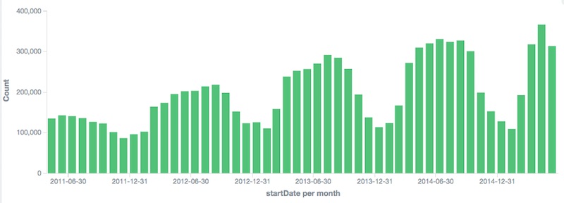
Above: A temporal prediction of a one dimensional metric in Timelion.
Worth noting, this talk is very much influenced by Zach Tong’s excellent series on implementing a statistical Anomaly detector with Elasticsearch. That’s a great place to start when reading on this topic.
The problem with my old demo
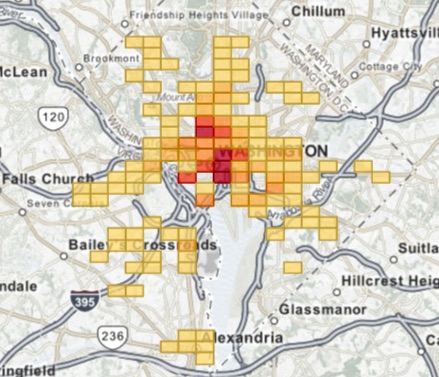
I love bikeshare data. I’ve written a few posts in the last year using public data from the good folks at Washington DC’s Capital Bikeshare program. ( here and here) and if you’ve talked to me at a demo booth or presentation of Kibana you’ve probalby seen me show my dashboard of bikeshare rides in DC and zoom into the 4th of July to show the data anomaly right around the fireworks show.

I love this demo! The problem is that it requires one to already have the knowledge of the data anomaly. What if Elasticsearch could help us find outliers and anomalies in the data automatically? Well, it can do that and it can even help us spot them happening in real time. Let’s see if it can help us spot other events around the city.
Elasticsearch features
I’ll need to use four key features of the Elasticsearch aggregations API.
- Two kinds of bucket aggregations (feature 1) and (feature 2)
- Nesting one aggregation inside another (feature 3)
- Pipeline aggregations with seasonality adjusted moving averages (feature 4)
The first part is being able to spot outliers in the data that are isolated to certain time and geo aspects of the data. These are basic histograms and geo-grid couts of event occurrances. There are direct calls to Elasticsearch’s aggregation APIs and directly related to queries visualized in Kibana.
1) Geo Buckets
GET /bike-dc/_search?search_type=count
{
  "aggs": {
    "mygrid": {
      "geohash_grid": {
        "field": "startLocation",
        "precision": 7
      }
    }
  }
}
2) Histogram Buckets
GET /bike-dc/_search?search_type=count
{
  "aggs": {
    "myhisto": {
      "date_histogram": {
        "field": "startDate",
        "interval": "month"
      }
    }
  }
}
3) Nested Buckets
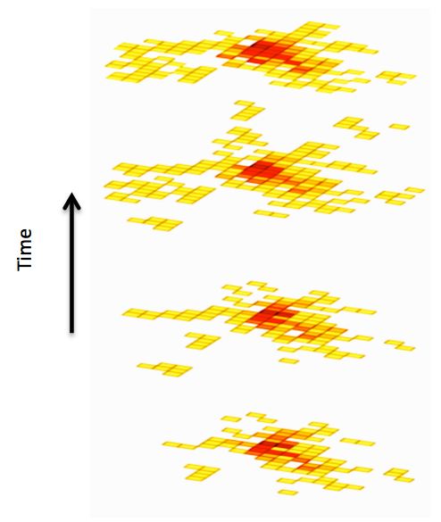
The next part is where things get fun. Elasticsearch lets you nest bucket aggregtion within other aggregations. We can combine the two bucket approaches above into a single analytic, asking Elasticsearch for histogram buckets inside a geo grid aggregation. The result is a matrix of the event metrics over time for each grid of my map returned in a single rest call.
Here’s a picture of bikeshare usage over several years to try to demonstrate the true meaning of the returned data.
GET /bike-dc/_search?search_type=count
{
  "aggs": {
    "mygrid": {
      "geohash_grid": {
        "field": "startLocation",
        "precision": 4
      },
      "aggs": {
        "ingridhist": {
          "date_histogram": {
            "field": "startDate",
            "interval": "year"
          }
        }
      }
    }
  }
}
4) Seasonal Moving Averages
Now for Each Bucket we can use the next power feature of Elasticsearch which is pipeline aggregations. Colin Goodheart-Smithe wrote a great blog post on computing derivatives with pipeline aggs, but what we’ll focus on moving averages.
Similar to Zach Tong’s blog post we’ll compute a “suprise” factor for each hour of data in each grid of geospatial area of DC. We’ll compute whether or not the number of bike rides departing from the area deviates from the general trend (moving average) of how many rides we expected to see depart from that station given general trends taking into account day of week and time of year. This will help us differentiate between the signal and the noise which is a common problem in all analytics.
There are many kinds of moving averages possible in Elasticsearch, but the one we are using will be Holt-Winters. This “triple-exponential” moving average takes into account the current level, trend in that level, as well as a seasonality in it’s computation of the moving average. Because capital bikeshare’s major periodic pattern is weekly, (every 7 days) we can ask for a moving average of bikeshare ridership and know if a spike is the normal Monday morning bike commute or something more interesting like a fireworks show or a baseball game. Holt-Winters can even do predictions into the future; which is cool, but since we are just looking for data outliers in the time range of the data that we have that won’t be necessary. Holt-Winters does require tweaking of coefficients for the relative weights of the three contributers to the “smart” average. I played around and found I got the best results just using the auto-minimization function which tries to guess good coefficients through a simulated-annealing optimization algorithm.
Putting it together
Here’s the final query I used to compute regionalized Geo-Temporal Seasonality adjusted moving averages.
GET /bike-dc/_search?search_type=count
{
  "aggs": {
    "mygrid": {
      "geohash_grid": {
        "field": "startLocation",
        "precision": 4
      },
      "aggs": {
        "ingridhist": {
          "date_histogram": {
            "field": "startDate",
            "interval": "hour"
          },
          "aggs": {
            "the_count": {
              "value_count": {
                "field": "memberType"
              }
            },
            "prediction": {
              "moving_avg": {
                "buckets_path": "the_count",
                "window": 672,
                "model": "holt_winters",
                "minimize": true,
                "settings": {
                  "type": "mult",
                  "period": 168
                }
              }
            }
          }
        }
      }
    }
  }
}
Kibana itself doesn’t have pipeline aggregations yet or do much in the way of Geo-Temporal, so it won’t run this type of query directly. However, with a quick python script I can run the custom query, loop over buckets in the aggregated data and re-insert “roll-up” aggregated events as a different metric type that can be visualized side by side with the original data. (code). The key line which computes the surprise factor:
doc['surprise'] = max(0, 10.0 * (doc["the_count"] - doc["prediction"]) / doc["prediction"])
This means that when the actual event count for an hour of bike rides in a grid on the map surpasses the general moving average count that would have been the prediction, we are guessing that there may be a data anomaly.
Each grid of the geo graph effectively becomes a single metric time series with a prediction. We can map the surprise value separately from the event density.
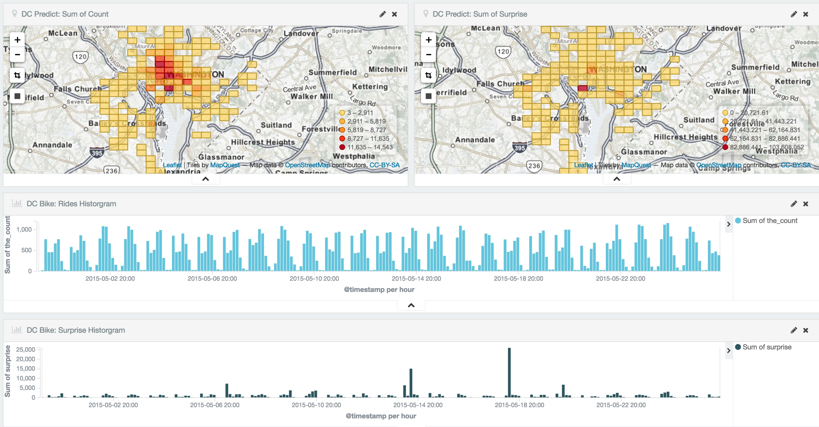
Verifying Results
If we zoom in on an area we’ll get a quick view of the ride event spike anomalies. To test the accuracy with real world events, I’ll look for something I can get a difinitive event history for. Zooming in on the baseball stadium on the in May of 2015 we see the following:
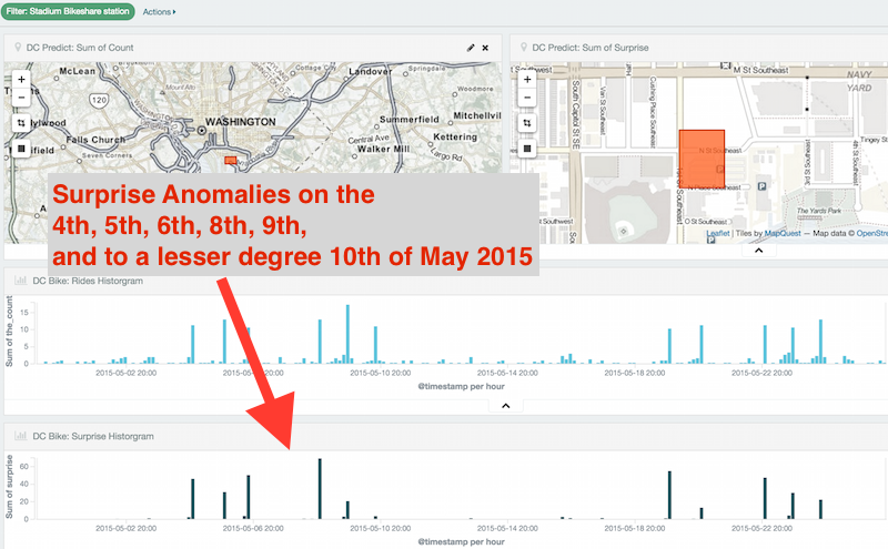
There were spikes above the trending moving average on the 4th, 5th, 6th, 8th, 9th, and a to a lesser degree (small suprise factor) on the 10th.
Compare this to the Washington Nationals Away/Home schedule that week and you’ll see we got it right.